ShopDreamUp AI ArtDreamUp

Deviation Actions


Suggested Deviants


![[YHH] Midnight Mists](https://images-wixmp-ed30a86b8c4ca887773594c2.wixmp.com/f/9794500c-6da5-47ff-a2a5-a11026d52381/dbji51i-08d4d19e-1593-45b6-9758-1ea4f67f4dcc.png/v1/crop/w_92,h_92,x_11,y_0,scl_0.055122828040743,q_70,strp/_yhh__midnight_mists_by_hairama_dbji51i-92s.jpg?token=eyJ0eXAiOiJKV1QiLCJhbGciOiJIUzI1NiJ9.eyJzdWIiOiJ1cm46YXBwOjdlMGQxODg5ODIyNjQzNzNhNWYwZDQxNWVhMGQyNmUwIiwiaXNzIjoidXJuOmFwcDo3ZTBkMTg4OTgyMjY0MzczYTVmMGQ0MTVlYTBkMjZlMCIsIm9iaiI6W1t7ImhlaWdodCI6Ijw9ODU1IiwicGF0aCI6IlwvZlwvOTc5NDUwMGMtNmRhNS00N2ZmLWEyYTUtYTExMDI2ZDUyMzgxXC9kYmppNTFpLTA4ZDRkMTllLTE1OTMtNDViNi05NzU4LTFlYTRmNjdmNGRjYy5wbmciLCJ3aWR0aCI6Ijw9MTI4MCJ9XV0sImF1ZCI6WyJ1cm46c2VydmljZTppbWFnZS5vcGVyYXRpb25zIl19.n18myoq7ozV3radfsSs_PsZ7e0OSaJGbQ-A3GjtMYc0)


Suggested Collections


You Might Like…


Featured in Groups
Description
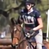
Practice blending, in water, and most importantly the mane and tail. It looks best in full view, or even better, at it's largest (DA isn't doing it justice for some reason D: ) Let me know what you think!
horse
background

horse
background
Image size
1600x899px 927.33 KB
© 2013 - 2024 THEQUEENOFENGLAND
Comments1
Join the community to add your comment. Already a deviant? Log In
Since you asked me for a critique, I will give it a try. It's my first, so bare with me. Haha.
To start off, I like your idea for the manip, and the chosen images are nice.
I'll begin with some details about the horse. The cropping is a bit off some places, which means that you've left some spots out, and it seems like you have used a tad harsh brush. I would have spent more time on the cropping, as that is important to make the horse blend in.
The next thing that I see, is the colors of the horse. The background is very green, and in this case, I would try to match the horse a bit. Play around with the color-settings, aswell as the curves (to make it a bit darker, the bg is pretty dark).
What I think is good, is the lightning, it looks right. And the mane/tail looks really good! <img src="e.deviantart.net/emoticons/s/s…" width="15" height="15" alt="
As for the background I don't have that much to say. It's a gorgeous background.
The splashes, though. They're too white/bright. Again, a re-color and maybe lower the opacity a bit, would probably do the trick. And remember that even though the horse is in movement, I don't think there would be that high splashes, if we should be realistic. But the splashes looks great, very realistic!
What I think would be nice (that's rather a tip than critique) is to blur the background a bit, so only the front is all clear. It gives more focus on the horse, and I think that's really pretty.
Other than that, I think you have a really good technique, but you need to focus on spending a little more time on your details.
Good work in general! <img src="e.deviantart.net/emoticons/s/s…" width="15" height="15" alt="